


In our daily lives, we encounter data visualizations in various forms: advertisements, news articles, social media posts, academic papers, reports, and dashboards. Occasionally, we come across visuals that spread misinformation. While lying with statistics has been a longstanding issue, visual misrepresentation has become more prevalent in media. But do data visuals themselves really lie? The answer is no. Charts, graphs, maps, and diagrams are inherently truthful—it's the people who design them that can be deceptive, either knowingly or unknowingly. Consider the definition of a "lie" in ethical literature: "An intentionally deceptive message in the form of a statement" (Bok 1999). The visual itself is that statement, not the person who creates it.


A visual can be misleading, however. Misleading differs from lying because a graphic can lead readers astray without its designer's conscious intention. This distinction is crucial. Professional ethics codes in journalism and graphic design firmly state that knowingly hiding the truth or distorting it is unacceptable.
When creating a data visual, consider your audience. It's essential to think about who will interpret your graph and how they might understand it.
When we encounter a chart or diagram, we generally assume the author's sincere desire to inform. Given this presumed sincerity, misusing graphical material perverts communication—akin to placing a detour sign that leads to an abyss (Wainer 2000).


Notice that Wainer does not imply that the author is trying to actively deceive you. The “misuse of graphical material” could have been completely unintentional, the same way that putting the detour sign on the wrong side of the road could be the product of sloppiness or ignorance.
If we agree that infographics must represent a reality—data, information—with accuracy, we must not just obsess over the conscious actions of communicators. We should also point out the responsibility we have to educate ourselves to overcome our own biases, shortcomings, and knowledge gaps. We must work hard to eliminate or, at least, to minimize ambiguity, confusion, and potential errors of interpretation in our graphics.
Graphic lies are commonly based on three techniques:
- Hiding relevant data to highlight what benefits us
- Displaying too much data to obscure reality
- Using graphic forms in inappropriate ways (distorting the data)
Let's examine a real-world example:
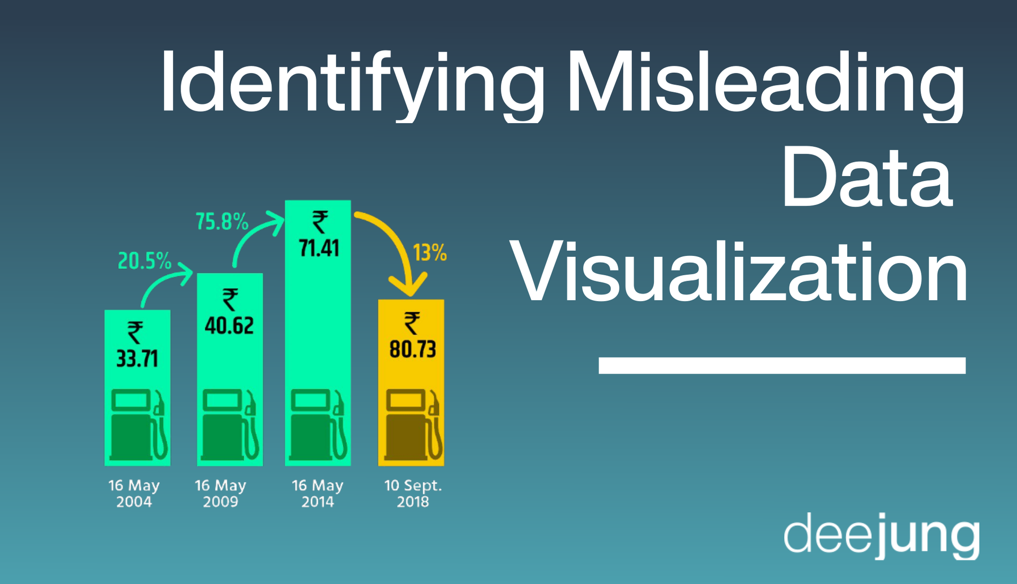
As of this writing, the Bharatiya Janata Party (BJP) is India's ruling political party. It's one of the country's two major political parties, alongside the Indian National Congress. In September 2018, during a nationwide protest against rising fuel prices, the BJP posted a tweet displaying changes in petroleum prices.

This bar graph displays time frames on the x-axis and the cost of petrol on the y-axis. Arrows with percentage numbers indicate the increase in petrol prices relative to the previous time frame.
The visual contains several misleading elements. Can you spot them?
Here's what I found:
- The height of the last bar doesn't accurately represent its value. The height of the rightmost bar is supposed to be higher than its corresponding bar because the value of price in the y-axis is relatively higher. However, the bar has been displayed inappropriately lower than the previous one. Thus, this misrepresentation has used the mechanism of using graphic forms in inappropriate ways.
- A downward-pointing arrow incorrectly suggests a price decline. The arrow accomplishes in satisfying two ways of displaying misleading graphics. First, the arrow is an unnecessary addition to the graph, since a bar graph is effective enough on its own to communicate relative quantities. Second, the arrow points downward, indicating a decline in the value of price. Just like the bar, the arrow uses the mechanism of using graphic forms in inappropriate ways.
- The first two bars covers an uneven timeframe compared to the others. While the last two time frames between the second bar and last bar is 4 years each, the time frame between the first bar and the second bar is 5 years instead. This is an unevenly matched representation which is not communicated by the graph. This misleading property also utilizes the mechanism of using graphic forms in inappropriate ways to communicate distorted information.
The misrepresented height and arrow symbol misleads the public to believe that the price of petroleum has fallen during the last 4 years instead of having increased. While the BJP did manage to fulfill their promise of stabilizing the price growth of petroleum by reducing the growth rate to 13%, they failed to communicate this information with scientific accuracy. The misrepresentation of time frames exaggerates the values represented in the graph. This favors the purpose of the graph in an unethical way.
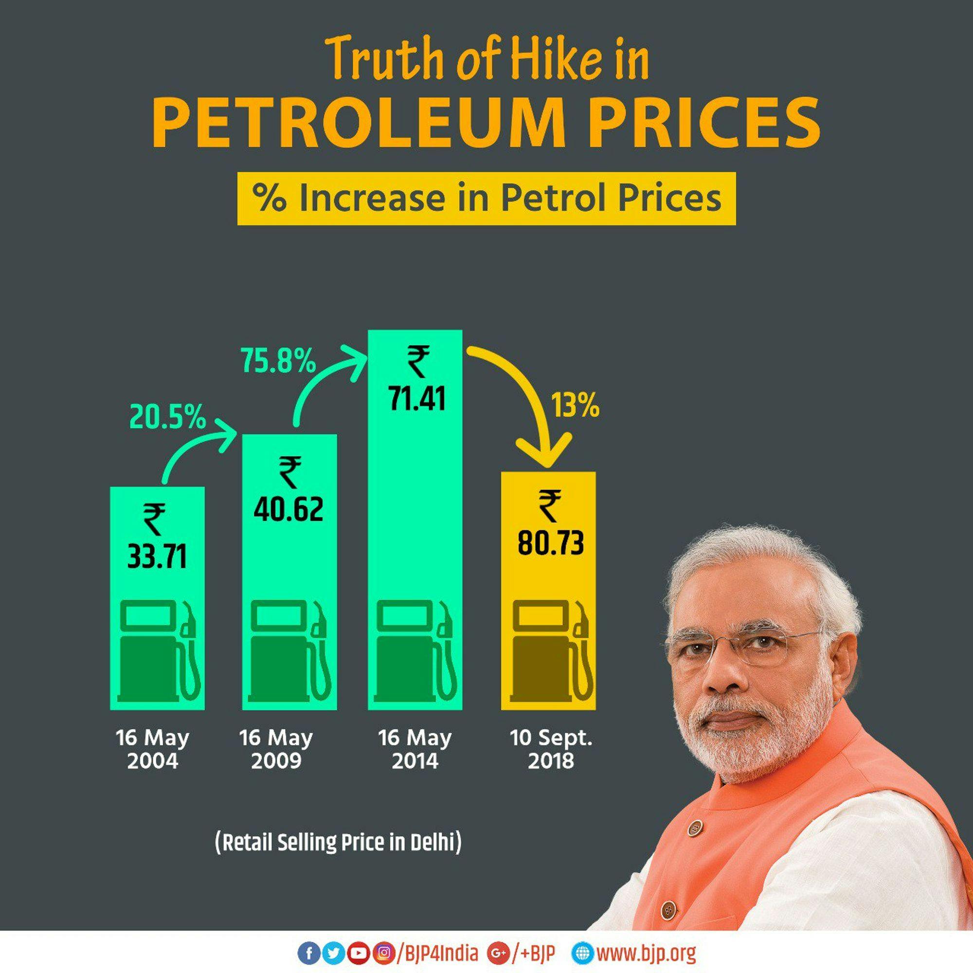
The attempt to mislead the public with inappropriate visuals backfired. The Indian National Congress, the opposing party, quickly responded with their own version of the graph. Their version accurately represented the data and included a comedic image of their leader.

